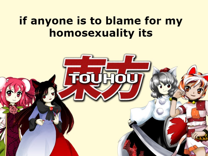
whAt A 2hu?
I'm sure everyone who ended up here is most likely already intimately familiar with touhou but for the sake of that ONE person (yeah, you) I'll add onto the pile of "Introductions to Touhou" as concisely as I can.
Touhou Project is a series of arcade style shot'em up games independently developed by Jun'ya Oota (nicknamed ZUN) beginning in 1996 and continuing into present day. There are dozens of mainline, spin-off and fighting games that I could list off but none of those really matter for an overview, what's made touhou so widespread in comparison to other random moe anime series and given it such longevity is how much it embraces doujin culture.
Doujinshi are self-published works, either original or based on an existing IP. They can be anything, manga, novels, video games, albums, you can basically think of them as "indie".
Touhou itself is a doujin work, the first and second games released simultaneously at Comiket 52, an annual doujin convention, selling a mere 80 copies. From there on, no matter how popular touhou became and how many opportunities ZUN had to sell the franchise, he kept ownership and let its doujin community flourish unabated. And so over the decades there has amassed an endless amount of fan works that have, and will keep touhou alive.
If you can't get enough of the characters there is a never ending amount of manga you could read,
if it's video games you wanna play, there are many professional-grade ones on digital platforms and consoles, if you're only really in it for ZUN's music, as many are, you have an inexhaustible catalog in any genre you'd like.
Touhou is as much the games as it is the community surrounding it.
CD Cover Art
I image most fans outside of Japan, where CDs are still commonplace, never give these games' cover art much thought, which is a shame as I think they do a great job of showcasing how flexible ZUN can be. I consider them to be split into two categories, like the games themselves, PC-98 and windows.
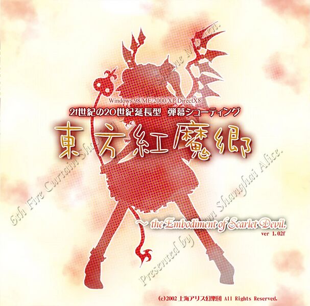
Coming right after PC-98, this one's background remains simpler than the rest with a silhouette made to pop out more taking front and center, it's somewhat bland though and I'm not a huge fan of the transparent diagonal text.
I like the colors on this one, the diagonal split works well and doubles as a nod to Yukari's border ability, if only the text within didn't get drowned out as much, seriously I can barely make out what it says!
Similar to EOSD except Suika blends in with the background a little more, itself remaining somewhat simple, I do quite appreciate the sparse streaks of yellow.
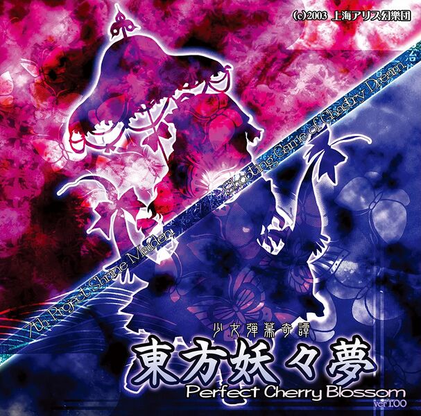
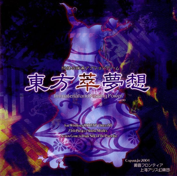
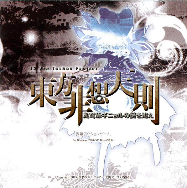
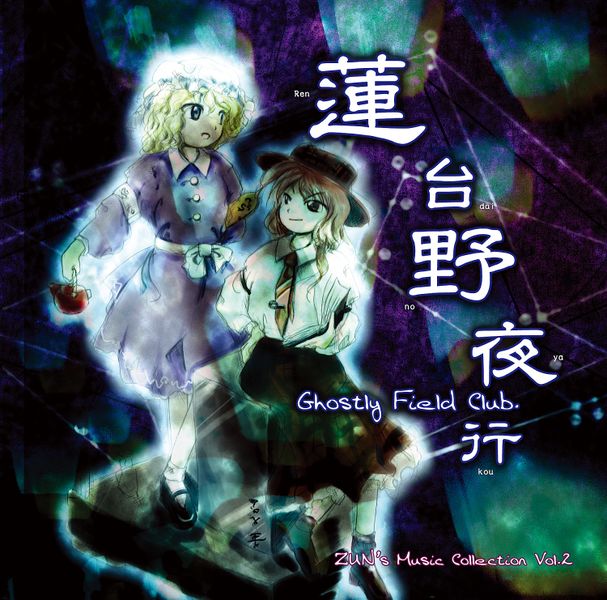
I'm on the fence with this one, the background is gorgeous, both the one in and outside the silhouette, I like the way the moon peeks in, and the colors work really well together, but at the same time the bottom part of the image feels like it's trying to get filled out by the silhouette and can't, the white outline further adding to this, the inclusion of a second, red moon with Mokou on it is a bit jarring, although it would be pretty empty without it, still, space could have been used up in a better way
(surely I'm not the only one who though it was supposed to be a cloaked moon when they first saw it, right?).
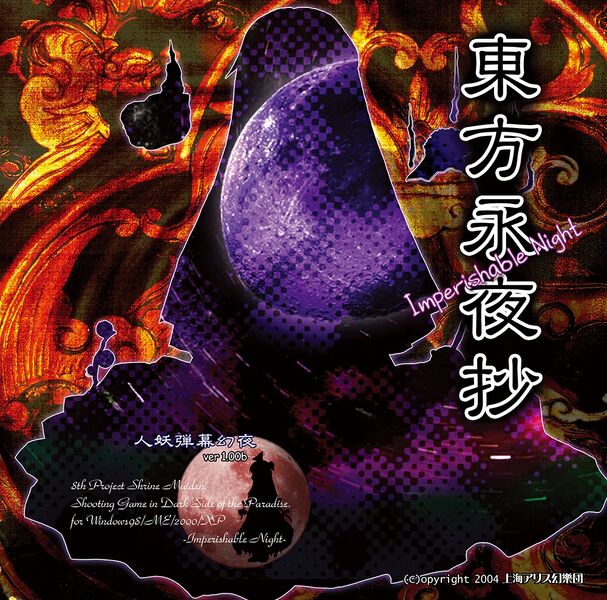
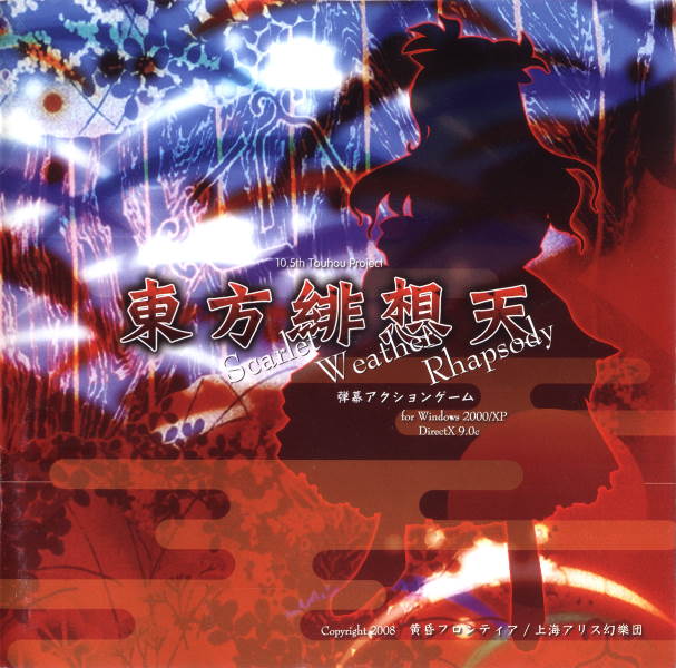
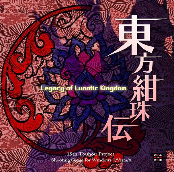
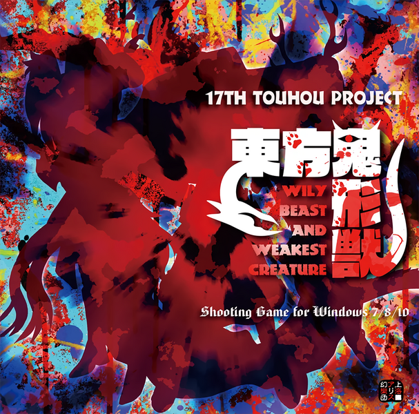
Mixed feelings on this one, incredibly noisy background but the four distinct colors bring it back into focus, despite being imposed in the middle Shiki doesn't stand out too much, not that that would be a bad thing necessarily. The blue text in the back has a font that clashes with the rest, is almost illegible behind the shadow of the title, and god, why is it cut off like that. The one crucial thing it does is serve as a counterpart to the silhouette in diverting attention from the points where the colors meet, it would absolutely be worse off without it.
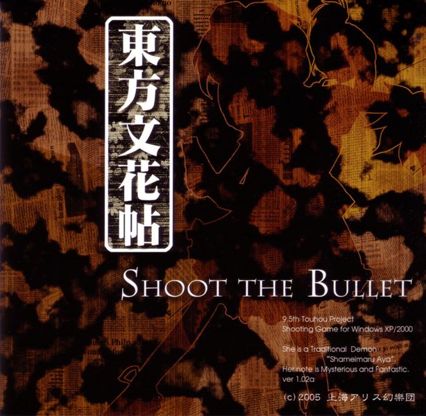
Oh this one is something special, less color, putting more of an emphasis on the newspaper background (which I love), kanji does something different sitting in its own box, the title, English and Japanese, compliment aya very well, overall great composition.
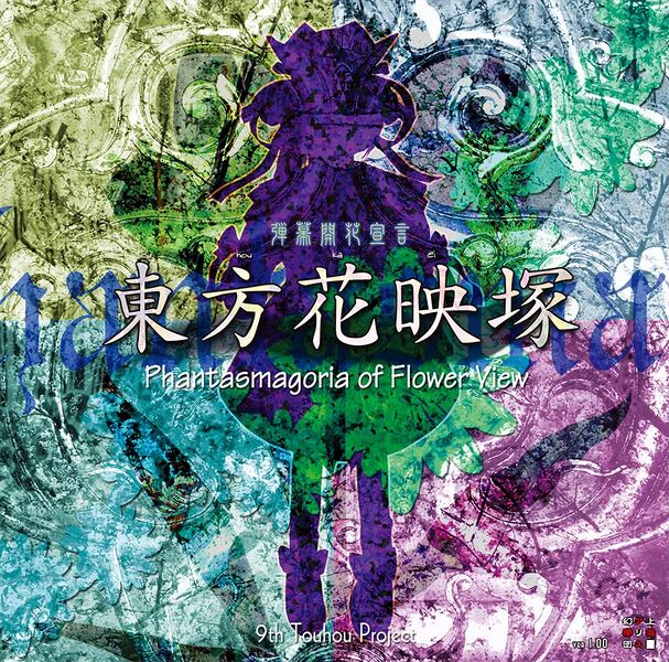
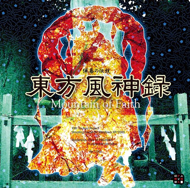
The silhouette here features an autumn forest, which is fitting and contrasts with the desaturated green, but it makes the fine print harder to read. Big fan of the dotted blobs and stars covering the whole image, title's typography also looks great.
The split in two is nice, Tenshi blends in a lot, took me a while to notice she was even there. I think the blue is supposed to look like a waterfall with the lines running horizontally across it being splashes of water and the long orange blobs rising from the bottom in the foreground clouds or fog tying in with the game's weather theme, I like how the fine print is positioned around these.
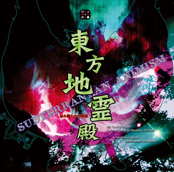
A darker one, befitting its game's setting, Utsuho's wings encompass most of the available space leaving little for the background, so instead it blends into her while changing color, unfortunately, this has the effect of making the whole thing somewhat shapeless, leaving you only with a pretty color pallet (it's a damn pretty color pallet tho).
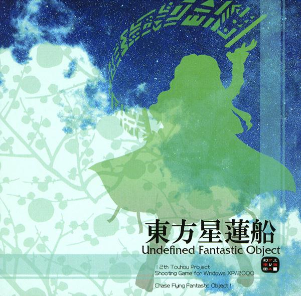
Simple but distinct, I like how everything is concentrated into the bottom-right corner, giving us more room to appreciate the clouds plus overlay background, colors look great together. Frutiger aero as fuck.
Top/bottom split, I appreciate the more toned down colors, makes the blue stick out in front of the brown while still mixing well with the white. The silhouette seems crisper than usual, Cirno's wings actually looking like ice is my favorite part of it, slightly annoyed at the extremely thin parts of the shadows cast by the kanji, makes it appear somewhat blurred when not looking at it closeup.
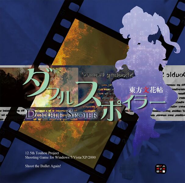
Not as good as Shoot the Bullet's but it still holds its own. I thought these covers could do without the maximalist backgrounds, or at the very least tone them down, but here the lack of one makes it feel a bit empty.
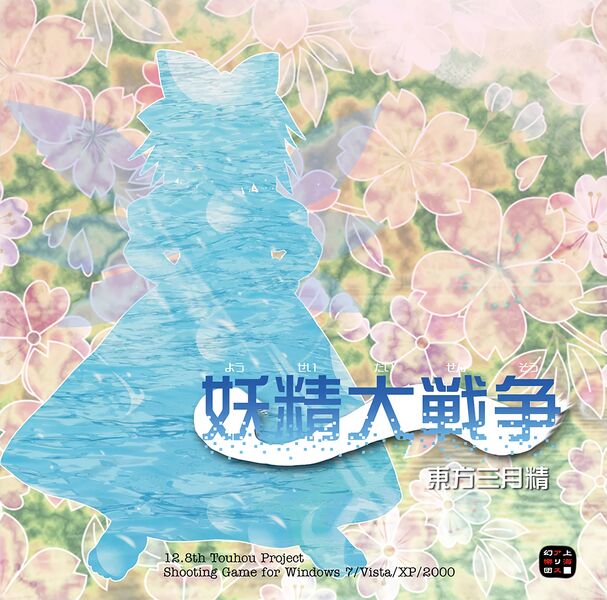
This one looks like an old-timey tablecloth(endearing). Typography is neat and the whole thing gives off a playful aura befitting its protagonist, but is overall kind of boring.
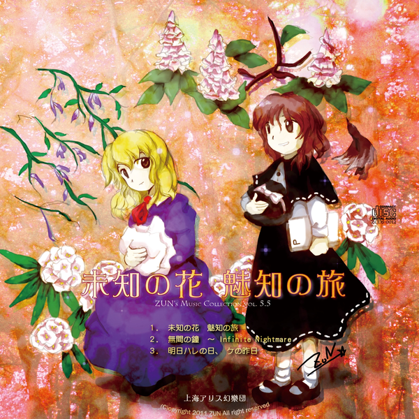
Texture is everything on this one, very subtle intricacies, look at those tiles behind the title all housing their own slightly unique flower. I love the fuzziness of the kanji making it look like it's printed on the same surface as the background, the light in the bottom-left corner coupled with the lighter, less vibrant colors make it look stylishly faded. Miko looks like a wine stain.
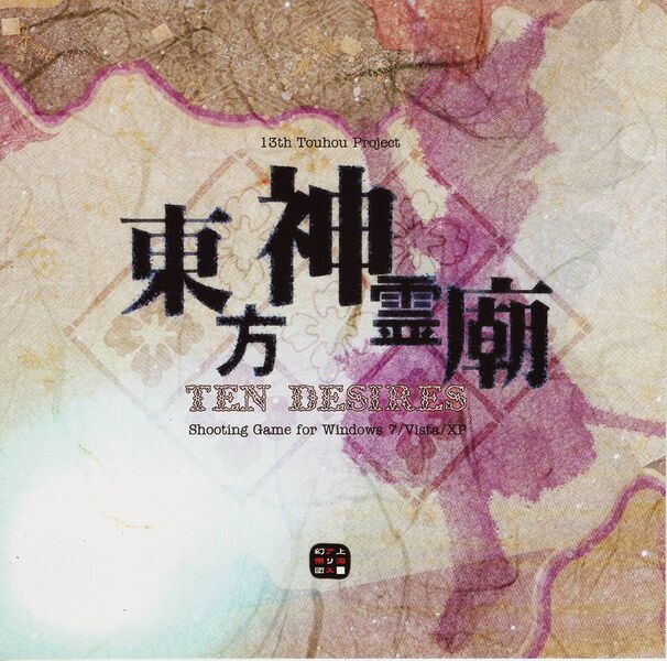
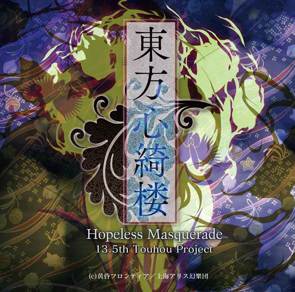
A bit of a mess around the lower three kanji, but other than that this one is a marvel to look at. Love how Kokoro is concealed yet plays a part in the composition, colors and textures are delightful, the only thing I'm iffy on is the centerpiece leaf behind the title, it would probably be too flat without it though.
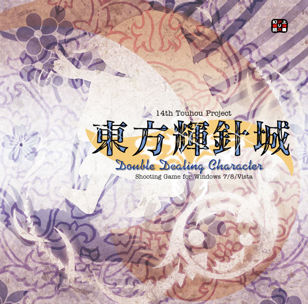
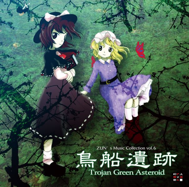
At first I though this one was about the same as 13's but without the texture, but upon closer inspection I noticed the background is much more intricate, it just doesn't stick out, Shinmy herself also doesn't stick out, the red swash even helping to conceal her (and so now I'm sitting here wondering if that was intentional or not, y'know cuz she's an inchling).
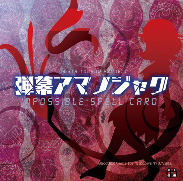
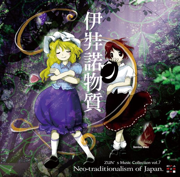
The columns in the back are about the only positive thing I have to say here. I usually dislike blocky text but it could be worse, what brings this one down is how little is going on in the foreground, the swirls and Seija have this ugly gradient that makes them stick out, it just looks very rushed.
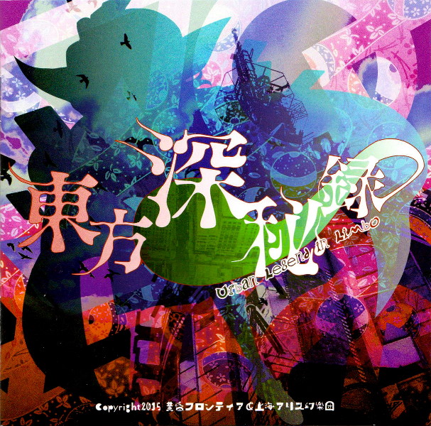
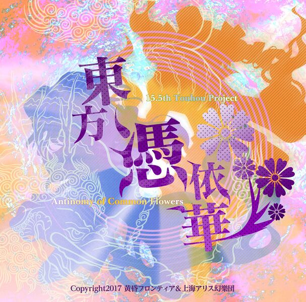
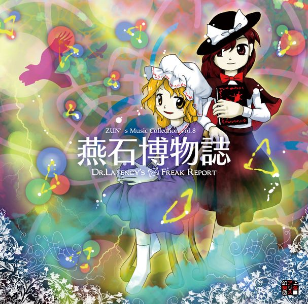
In a weird sense this one is like a more realized version of impossible spellcard's, the background has a bit too much going on but you can still make out the city. Sumireko nicely fills out the upper part, the colors on her also look nice, they go well with the green spirit under the title. The silhouette being transparent while not having an outline makes the whole thing somewhat amorphous, in a good way.
Hands down the best cover ZUN has made, I love everything here, it all comes together so nicely. The background is ornate and beautiful, the red branch fills out the left-hand side, its glossy black outline both distinguishing it and making it fit in with the background, the flower in the center doing much the same but more toned down. Junko's shadow is on the side with the kanji curving along atop her, completing the circle started by the branch, and then the small glowing title in the middle holding it all together, what a delight!
Despite being one of my all time favorites I'm struggling to put into words why that is. I suppose it's the strong contrast between blue and orange together with how warm and clean it all is. Purple kanji pop out while still fitting in and the flowers are a really nice touch.
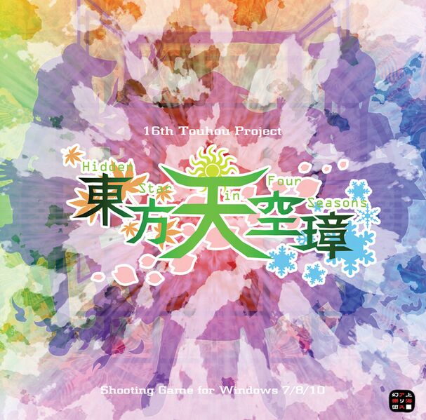
Huge focus on the kanji here. The triple silhouette is very faded and stays behind the clouds, keeping it from overwhelming the whole image. The four seasons are represented through the background colors, all nicely flowing into one another, the clouds almost makes it look like watercolor too. The title also features the seasons in a very unobtrusive manner, even with all that I ultimately find myself forgetting this one exists.
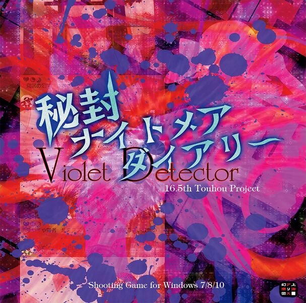
God this one's a mess, why the paint splotches, why is everything roughly the same color, what even is the background? There's a silhouette somewhere in there, if you look hard enough.
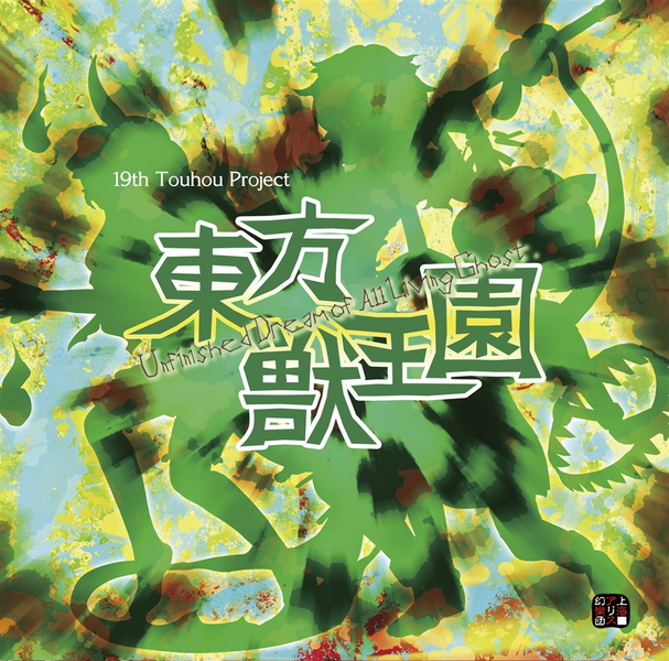
Remember how touhou 16 had a really nice triple silhouette because it kept it from overwhelming everything? Well that's all out the window now, have this shapeless blob that doesn't look good even when you do know what the characters look like. The kanji looks overly bulky and goofy, I do kind of like the messy painting background though.
This one is very different from the rest, I'm not really sure if ZUN worked on it, regardless it's quite good. The kanji look oily, so does Yuuma, she's pretty much hidden until you've familiarized yourself with her portrait. The background looks like it's had oil poured on it, all collecting at the bottom (the ingame Sea of Petroleum). I only wish you could make out more of the picture in the back, I think it's some kind of factory?
Not bad, just not very memorable. The mellow colors contrast well with the metallic title. I like the thick perforated lines going across, the one in the back blends nicely with the background and the one in the front splits the foreground. Chimata fits in well enough (ever noticed how, unlike in her ingame portrait, her finger isn't sticking out).
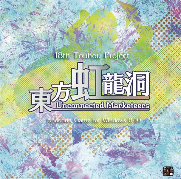
Much like touhou 17 except the characters are more distinct from each other, the title looks way better and the colors are more pleasant to look at.
and here's all of them in a tierlist ★ PC-98 ★
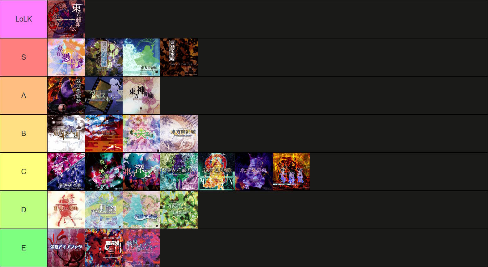
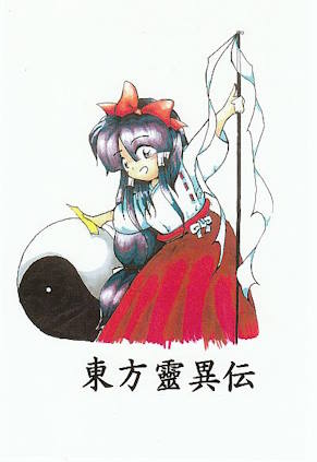
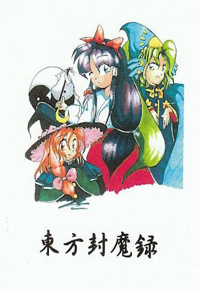
I don't have anything substantial to say about the PC-98 covers, they all have their own charm, different from that of the windows ones. First one is just Reimu with her ying-yang orb. The second one features Mima and Marisa, who oddly enough looks more like her later iterations than the one that appears ingame. Touhou 3's is adorable with all the characters floating around Reimu. It's hard to choose a favorite between 4 and 5. The fourth is probably the nicest composition wise, Reimu and Marisa are cute, the leaves and flowers are a nice touch. The fifth's however, I find incredibly cozy, I seem to have some deeply internalized sense of comfort for the interiors of rooms that look like they've been decorated by a widowed granny, there's just something so calming about lived in spaces like these. This one tapping directly into that feels like it's cheating honestly (the jugs in baskets are such an old countryside person thing lol).
Some of ZUN's other old art also elicits this.
☯ MUSIC CDs ☯
Alongside games ZUN also releases albums with their own stories, usually involving Renko and Maribel, I won't be talking about the stories as that would get too long winded, and besides, this is about cover art.
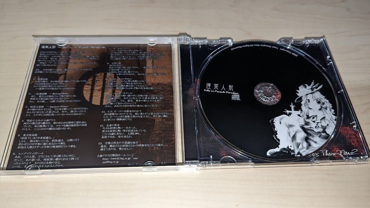
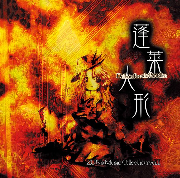
Unlike the rest of ZUN's albums, Dolls in Pseudo Paradise doesn't feature Renko or Mary, instead we get the unnamed "cover girl", two of them actually, as most touhou CDs themselves have art different from that of the case, speaking of which, this one has a very faded look, nothing sticks out, the girl herself seems like she's blending in the way her lower half is obscured, though still manages to serve as a nice centerpiece. Kanji is simple and gives your eyes something to anchor to, as everything else just feels like a background. One of my favorites, I have a soft spot for amber color pallets.
Having a ghost theme this one uses gloomier colors. Renko and Mary have enough bloom on them to make them seem transparent (though I don't think they actually are), they're sitting on a stone, I think a grave, couple this with a background lacking any discernible features aside from the connecting lines and they look as if they're floating in a void somewhere. The kanji nicely complementing them by warping around and filling out the right side.
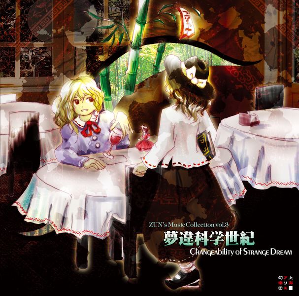
The girls at a restaurant, there's a suspiciously Yukari like gap stemming from behind Mary, revealing some bamboo shoots (I like how one of them enters the scene). The vibrant green juxtaposes itself nicely atop the dull browns, even the view from out the window is the exact same palette as the one inside, also in the background are some superimposed textures, one of which is this stripe with blocky spirals that ZUN likes to use, it can be prominently seen on Dolls in Pseudo Paradise and in the corners of Retrospective 53 Minutes.
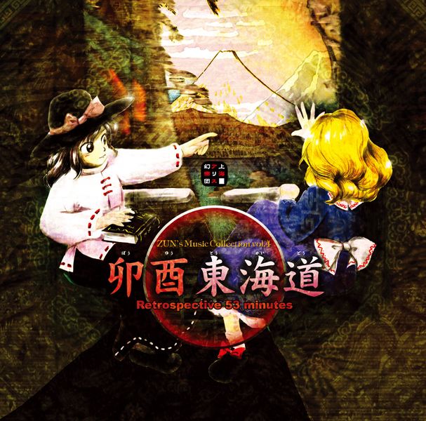
Renko and Mary on a 53 minute train ride. Center focused with that circle in the middle and the girls on both sides, there's an overlaid pattern most prominent on whatever the two are sitting, there doesn't seem to be any seats after all, rather the walls protrude inwards, it's not very noticeable though and the way it's used to fill out the margins, coupled with the bright view of MT. Fuji, gives it an enclosed feel (in a comfortable sense).
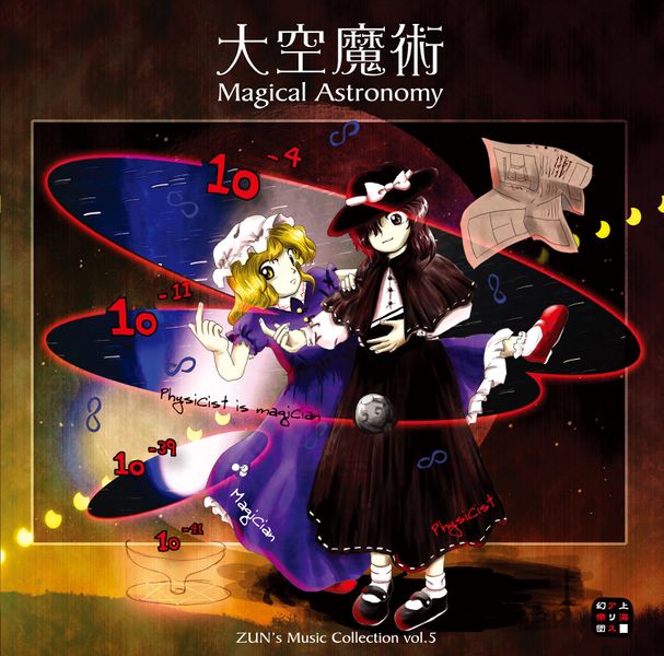
Very eye catching this one. I'm not sure if there's a name for it, but I love the frame with characters clipping out of it trope, here it's not only them, so are the planetary orbits (I think that's what they're meant to be, there's a little moon intersecting one), as well as what looks like a continuous moon cycle going across the entire image. The background sky is warm, with its own vaguely visible moon, and where it overlaps with the frame it shares opacity with a starry sky, and where that overlaps with an orbit, a picture of a galaxy is revealed. Another thing playing into the the frame is the plain title centered atop it (also notice Renko finally got her capelet here).
Not too much to say on this one, I like the hand-drawn flowers circling Mary and Renko, I wish ZUN drew more flora rather than using pre-made ones. Orange background with white coming through at places makes it look super bright (no clue what the thing to the right of Renko is supposed to be, a bird?)
Don't have much to say here either. The characters and title are positioned nicely in regards to one another, Mary on top, Renko extending to the side, the title feels "tucked in place". The background is just grass, almost like one you'd see in the background of a touhou game. The overlay seemed odd to me at first, but it does fill out the outer rim of the image, the darker patch behind the title is also a nice touch.
Beautiful colors on this one, green and purple go so well together. The background feels more like an actual place, a forest, not in part due to the blurred bits of foliage peeking in and the light shining down. The characters also play a part in this, the swirl going from top to bottom, aside from simply looking pleasant, serves to split the two, making it seem like Renko is further behind, it also acts as a visualization of the wind blowing her hair and skirt back, as well as creating the bulge in Mary's. It goes without saying that the kanji in the middle further adds to this, and I also really appreciate how the English title has been pushed to the corner, the two are rarely separated and here it makes the composition feel more complete. the various items with names attached are a weird but cute addition. (peach)
The one with the weird title (even by this series's standard). Very colorful with lots going on in the background, curving lines, electricity, bird silhouettes, the connected red, green and blue spheres (I'm pretty sure those are supposed to be quarks). we're given some room to appreciate it all by having the characters positioned to the right, anchored to the contrastingly simple title which itself is complimented nicely by the floral patterns in the bottom corners, these two elements creating a sense of there being two distinct upper and lower layers, it's playful.
First thing that sticks out here is that couch, it's a 3D model, not inherently bad, but the way it's used sure is, it's illuminated from the direction of that horribly distracting lens flare, almost as if it's the thing emitting the light, unfortunately the tree behind it doesn't share in this making it look really flat, doubly so when you consider its ornaments, There's no floor in this scene, the couch could serve to establish a baseline for where it might be, but that kind of falls apart when you notice it overlaps the red circle in the foreground. The yellow swirl on the right is somewhat intrusive and just plain ugly, same goes for the title, I especially dislike the English text's font (at least we get to see Renko with her hair done).
The title here is the most minimal it's ever been, there's lines going in every direction, one of which is conveniently underlining it, I just wish they went behind the mountains as they do the characters. This time the overlay is a littering of these uneven blocks of color, keeping the image a little busier, something I think the big dipper is also supposed to be doing but it's not prominent enough, though leaving the sky emptier might have been intentional (I like it either way). About the only typographic flourish is the rounded copyright text at the bottom, it somehow makes it seem more top heavy(?), as if it's trying to brings your eyes back up. (why is Renko beatboxing?)
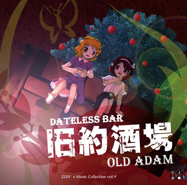
This isn't everything, there's still the covers for the CDs accompanying the print works and the CDs for the fighting games' soundtracks. I'm excluding these not only because it would significantly bloat the list, but also because they're done by other artists, differing enough to render their inclusion here redundant (at least in my eyes)
The PC-98 ones always feature Reimu (and often others) on a white background with any text appearing in black, in these regards they're much simpler compared to what comes later. They're all done in a water color style that has this incredible warmth to it, part of me wishes we still got covers like these, absolutely peak ZUN art.
On the other hand you have the windows games which are digital, with a focus on graphics and textures. Here covers usually involve much busier, colorful backgrounds with a silhouette of the game's key character(s) and some very stylized title text.
fuck it, let's talk about each one
One thing which makes these stand out from the windows games' is that they feature actual illustrations of the characters as opposed to only their silhouettes, this has the effect of more often incorporating them into the image.
(weird to think that this is older than Perfect Cherry Blossom)
TO DO: akyu's untouched score
EOSD's Earliest Title Screen
Touhou doesn't offer much in terms of unused content, it seems ZUN has a fairly streamlined process from conceptualization to realization, what little you do get is usually limited to character portraits.
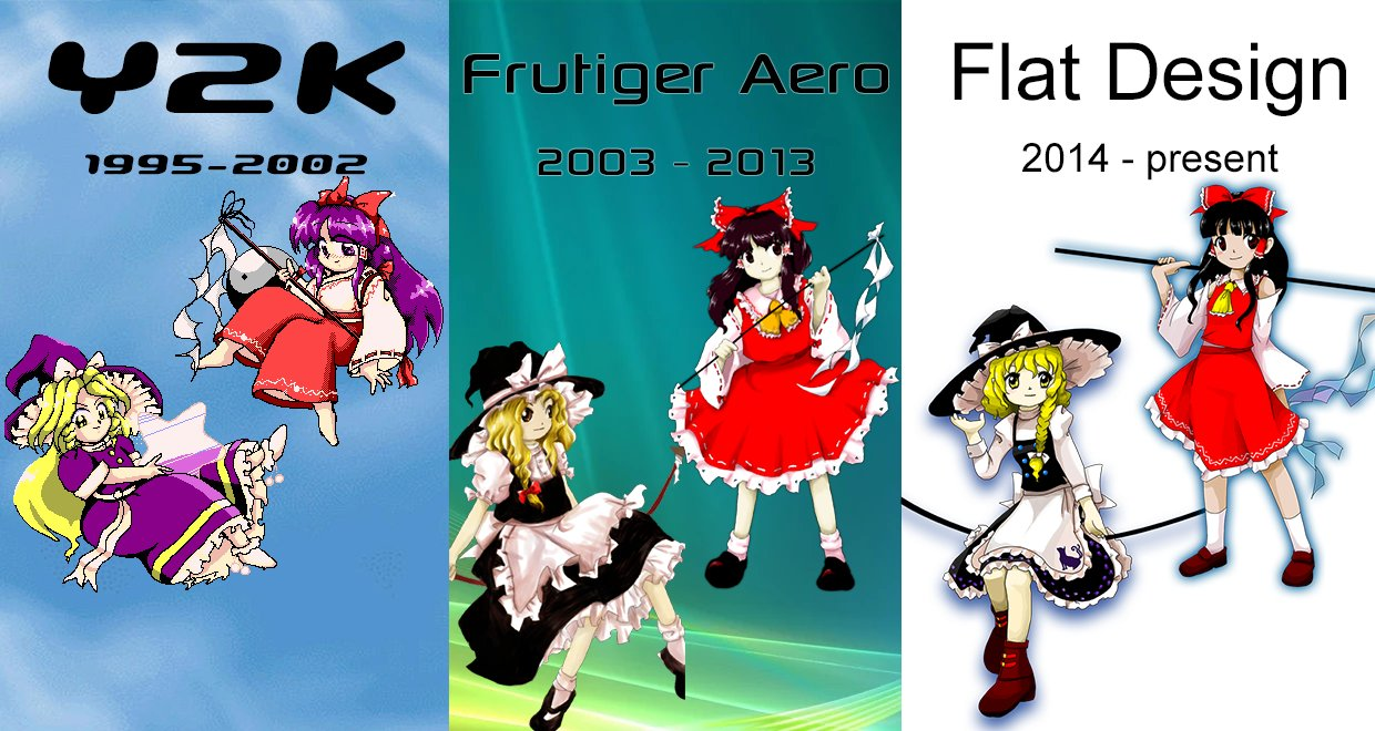
That's why I find EOSD's development fascinating to look back on, to me it has a very different "feel" than the games following it that I find hard to describe, I chalk this up mostly to Y2K nostalgia and being rougher around the edges; of course being the jump to windows it has a lot of "firsts", and courtesy of this a lot more pre-release changes.
This is the final 1.00 version's title, pretty iconic
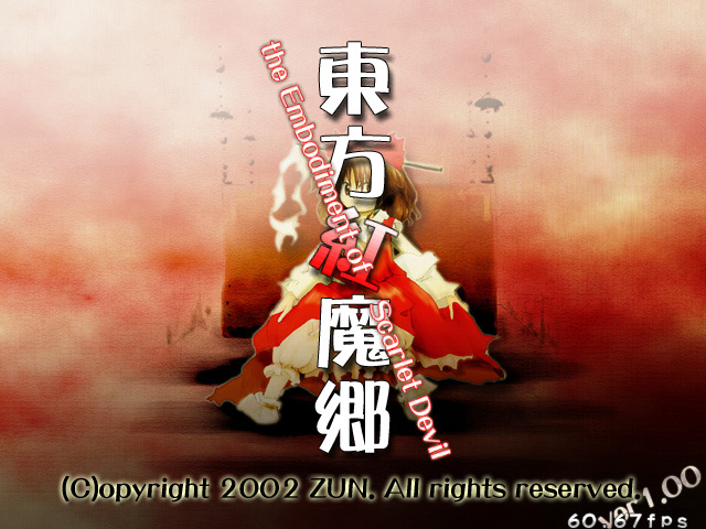
but at some point it featured a parchment-like texture and much duller colors
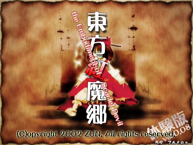
when you couple this with a screenshot of an older Rumia background, the scarlet mist, one gets the impression that the game were to have a darker atmosphere.
But what really blew me away was that this older title was itself a revision of an even earlier version
this is the earliest image unearth of EOSD, and it's interesting to think we could have had something so different. For one the beloved "sitting Reimu" is missing and in her place is a window looking out to the Scarlet Devil Mansion, and the background is so puzzling, like it's a forest with a bunch of roots sprawled about, but also there's this overlay that has some ornate wood engravings that blend in with it, so I'm not sure if it's meant to be the inside of a house or a window floating in a forest somewhere?
It probably isn't meant to be anything and ZUN just thought it looked nice, regardless it's a bit more ominous than what we end up with later. It makes me wonder, how different would the future games' title screens be if this were to set a precedent back then.
achievements, favorites, misc.
here's my 1cc chart (can you tell I like Mof and SA?)
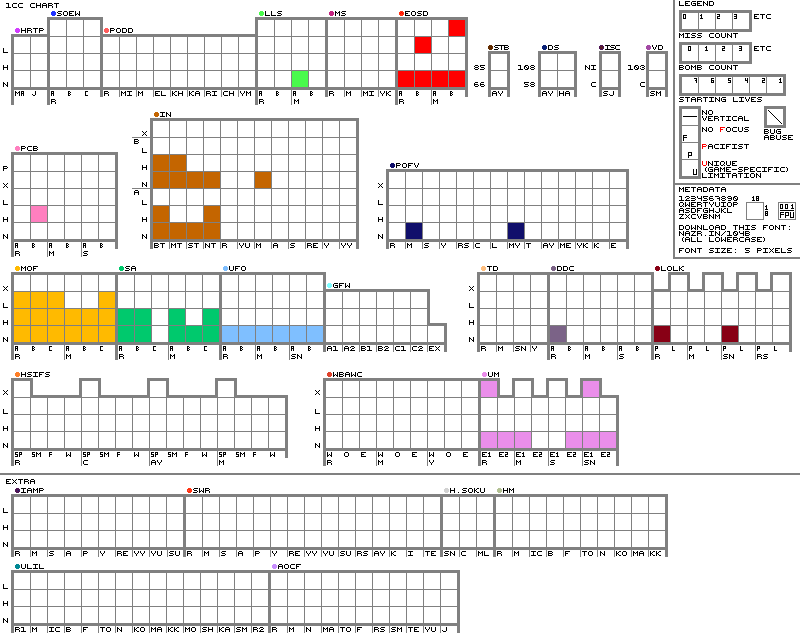
current goals are: HSiFS-normal, SA-lunatic, UFO-hard
☯
here's my most recent character sorter
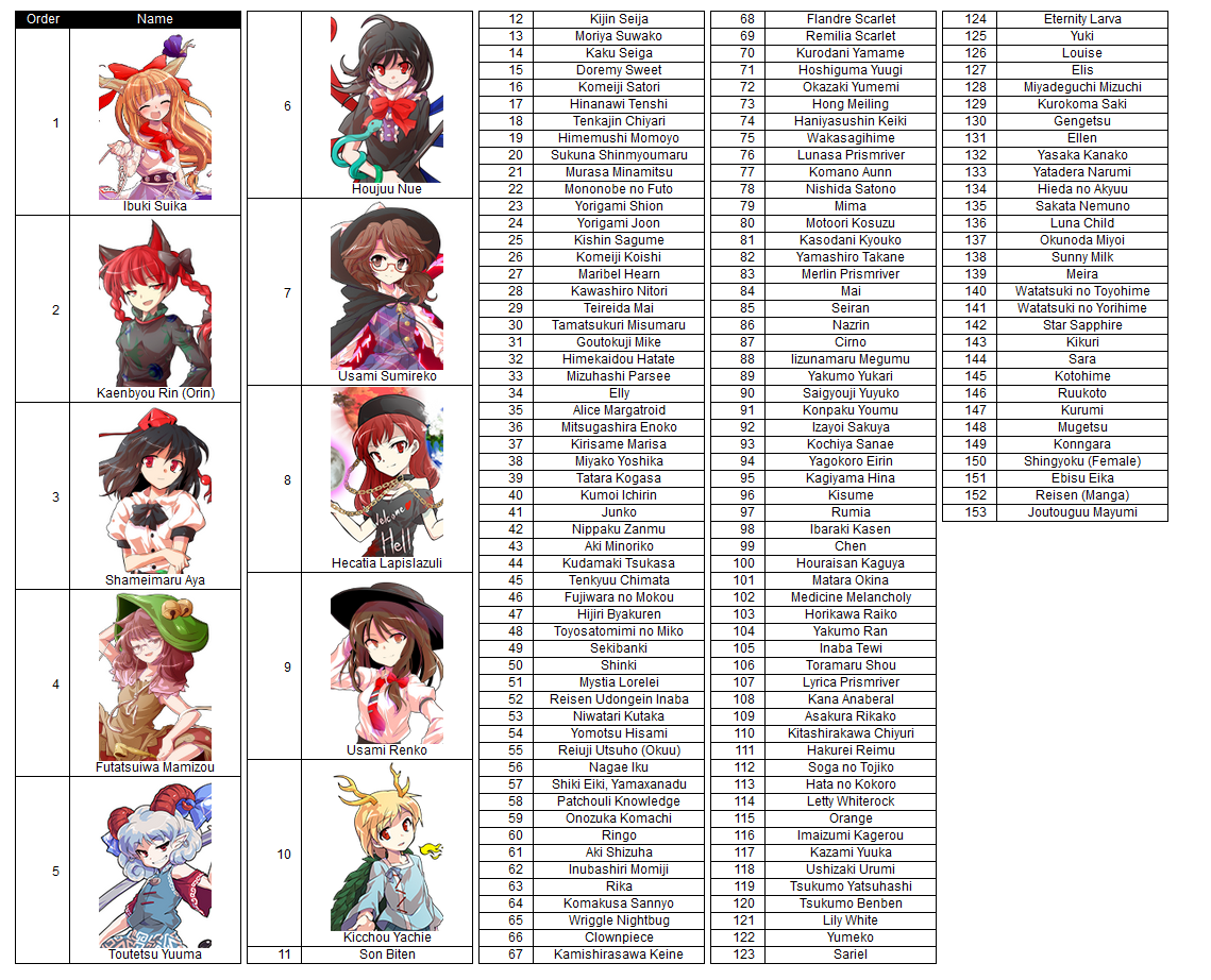
it ended up kind of odd, I wouldn't quite rank them like this, but it's close enough
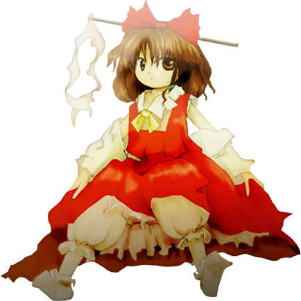
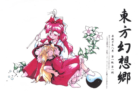
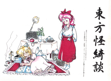
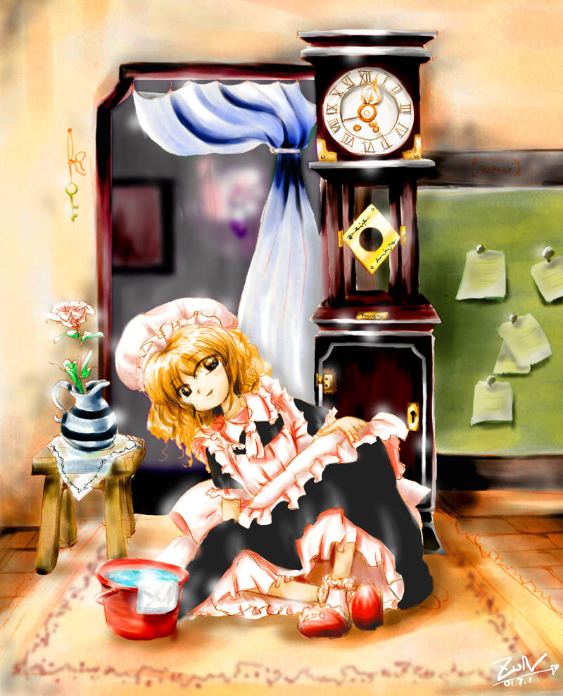
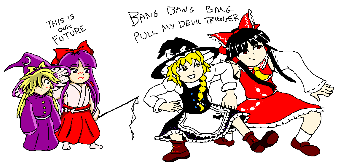
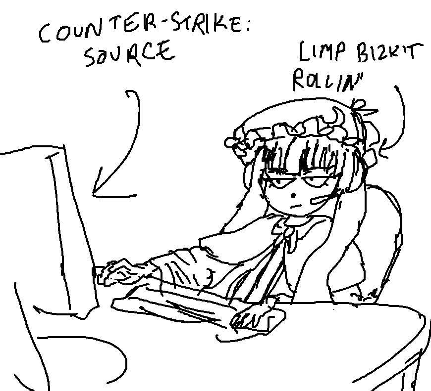
have a bunch of vaguely 2hu related images as a placeholder until I add more to this page


 back
back